Introduction to Data Visualization with R Tutorial
Source: This introduction data visualization with R tutorial is authored by Nordmann, E., McAleer, P., Toivo, W., Paterson, H. & DeBruine, L. (2022). Data visualisation using R, for researchers who don’t use R. Advances in Methods and Practices in Psychological Science. https://doi.org/10.1177/25152459221074654
See also: https://psyteachr.github.io/introdataviz/index.html
Tutorial workbook
This workbook contains the code from the tutorial paper. You can add notes to this file and/or make a duplicate copy to work with your own dataset.
The document outline tool will help you navigate this workbook more easily (Ctrl+Shift+O on Windows, Cmd+Shift+O on Mac).
This workbook contains code chunks for all the the code and activities in the tutorial. If you wish to create extra code chunks, you can use the Insert Code - R menu (a green box with a C and a plus sign) or use the keyboard shortcuts (Ctrl+Alt+I on Windows, Cmd+Option+I on Mac).
When you are working in a Markdown document, the working directory (where R looks for data files to import, and where it will save any output you create) will default to the folder that the .Rmd file is stored in when you open RStudio by opening the Markdown document. For this reason, make sure that the .Rmd file and the data file are in the same folder before you begin.
Chapter 2 Getting started
Loading packages
Remember that you need to install the packages before you can load them - but never save the install code in your Markdown.
library(tidyverse)
## ── Attaching packages ─────────────────────────────────────── tidyverse 1.3.2 ──
## ✔ ggplot2 3.4.0      ✔ purrr   1.0.0
## ✔ tibble  3.1.8      ✔ dplyr   1.0.10
## ✔ tidyr   1.2.1      ✔ stringr 1.5.0
## ✔ readr   2.1.3      ✔ forcats 0.5.2
## ── Conflicts ────────────────────────────────────────── tidyverse_conflicts() ──
## ✖ dplyr::filter() masks stats::filter()
## ✖ dplyr::lag()    masks stats::lag()
library(patchwork)
Simulated dataset
For the purpose of this tutorial, we will use simulated data for a 2 x 2 mixed-design lexical decision task in which 100 participants must decide whether a presented word is a real word or a non-word. There are 100 rows (1 for each participant) and 7 variables:
Participant information id: Participant ID age: Age 1 between-subject independent variable (IV):
language: Language group (1 = monolingual, 2 = bilingual) 4 columns for the 2 dependent variables (DVs) of RT and accuracy, crossed by the within-subject IV of condition:
rt_word: Reaction time (ms) for word trials rt_nonword: Reaction time (ms) for non-word trials acc_word: Accuracy for word trials acc_nonword: Accuracy for non-word trials
Loading data
dat <- read_csv(file = "ldt_data.csv")
## Rows: 100 Columns: 7
## ── Column specification ────────────────────────────────────────────────────────
## Delimiter: ","
## chr (1): id
## dbl (6): age, language, rt_word, rt_nonword, acc_word, acc_nonword
##
## ℹ Use `spec()` to retrieve the full column specification for this data.
## ℹ Specify the column types or set `show_col_types = FALSE` to quiet this message.
Handling numeric factors
summary(dat)
##       id                 age           language       rt_word
##  Length:100         Min.   :18.00   Min.   :1.00   Min.   :256.3
##  Class :character   1st Qu.:24.00   1st Qu.:1.00   1st Qu.:322.6
##  Mode  :character   Median :28.50   Median :1.00   Median :353.8
##                     Mean   :29.75   Mean   :1.45   Mean   :353.6
##                     3rd Qu.:33.25   3rd Qu.:2.00   3rd Qu.:379.5
##                     Max.   :58.00   Max.   :2.00   Max.   :479.6
##    rt_nonword       acc_word       acc_nonword
##  Min.   :327.3   Min.   : 89.00   Min.   :76.00
##  1st Qu.:438.8   1st Qu.: 94.00   1st Qu.:82.75
##  Median :510.6   Median : 95.00   Median :85.00
##  Mean   :515.8   Mean   : 95.01   Mean   :84.90
##  3rd Qu.:582.9   3rd Qu.: 96.25   3rd Qu.:88.00
##  Max.   :706.2   Max.   :100.00   Max.   :93.00
str(dat)
## spc_tbl_ [100 × 7] (S3: spec_tbl_df/tbl_df/tbl/data.frame)
##  $ id         : chr [1:100] "S001" "S002" "S003" "S004" ...
##  $ age        : num [1:100] 22 33 23 28 26 29 20 30 26 22 ...
##  $ language   : num [1:100] 1 1 1 1 1 1 1 1 1 1 ...
##  $ rt_word    : num [1:100] 379 312 405 298 316 ...
##  $ rt_nonword : num [1:100] 517 435 459 336 401 ...
##  $ acc_word   : num [1:100] 99 94 96 92 91 96 95 91 94 94 ...
##  $ acc_nonword: num [1:100] 90 82 87 76 83 78 86 80 86 88 ...
##  - attr(*, "spec")=
##   .. cols(
##   ..   id = col_character(),
##   ..   age = col_double(),
##   ..   language = col_double(),
##   ..   rt_word = col_double(),
##   ..   rt_nonword = col_double(),
##   ..   acc_word = col_double(),
##   ..   acc_nonword = col_double()
##   .. )
##  - attr(*, "problems")=<externalptr>
glimpse(dat)
## Rows: 100
## Columns: 7
## $ id          <chr> "S001", "S002", "S003", "S004", "S005", "S006", "S007", "S…
## $ age         <dbl> 22, 33, 23, 28, 26, 29, 20, 30, 26, 22, 48, 21, 31, 26, 25…
## $ language    <dbl> 1, 1, 1, 1, 1, 1, 1, 1, 1, 1, 1, 1, 1, 1, 1, 1, 1, 1, 1, 1…
## $ rt_word     <dbl> 379.4585, 312.4513, 404.9407, 298.3734, 316.4250, 357.1710…
## $ rt_nonword  <dbl> 516.8176, 435.0404, 458.5022, 335.8933, 401.3214, 367.3355…
## $ acc_word    <dbl> 99, 94, 96, 92, 91, 96, 95, 91, 94, 94, 95, 95, 92, 98, 97…
## $ acc_nonword <dbl> 90, 82, 87, 76, 83, 78, 86, 80, 86, 88, 83, 84, 82, 89, 84…
head(dat)
## # A tibble: 6 × 7
##   id      age language rt_word rt_nonword acc_word acc_nonword
##   <chr> <dbl>    <dbl>   <dbl>      <dbl>    <dbl>       <dbl>
## 1 S001     22        1    379.       517.       99          90
## 2 S002     33        1    312.       435.       94          82
## 3 S003     23        1    405.       459.       96          87
## 4 S004     28        1    298.       336.       92          76
## 5 S005     26        1    316.       401.       91          83
## 6 S006     29        1    357.       367.       96          78
dat <- dat %>%
  mutate(language = factor(
    x = language, # column to translate
    levels = c(1, 2), # values of the original data in preferred order
    labels = c("monolingual", "bilingual") # labels for display
  ))
Demographic information
dat %>%
  group_by(language) %>%
  count() %>%
  ungroup()
## # A tibble: 2 × 2
##   language        n
##   <fct>       <int>
## 1 monolingual    55
## 2 bilingual      45
dat %>%
  count()
## # A tibble: 1 × 1
##       n
##   <int>
## 1   100
dat %>%
  summarise(mean_age = mean(age),
            sd_age = sd(age),
            n_values = n())
## # A tibble: 1 × 3
##   mean_age sd_age n_values
##      <dbl>  <dbl>    <int>
## 1     29.8   8.28      100
age_stats <- dat %>%
  summarise(mean_age = mean(age),
            sd_age = sd(age),
            n_values = n())
dat %>%
  group_by(language) %>%
  summarise(mean_age = mean(age),
            sd_age = sd(age),
            n_values = n())
## # A tibble: 2 × 4
##   language    mean_age sd_age n_values
##   <fct>          <dbl>  <dbl>    <int>
## 1 monolingual     28.0   6.78       55
## 2 bilingual       31.9   9.44       45
Bar chart of counts
ggplot(data = dat, mapping = aes(x = language)) +
  geom_bar()

Figure 1: Bar chart of counts.
Plotting existing aggregates and percent
dat_percent <- dat %>%
  group_by(language) %>%
  count() %>%
  ungroup() %>%
  mutate(percent = (n/sum(n)*100))

ggplot(dat_percent, aes(x = language, y = percent)) +
  geom_bar(stat="identity")
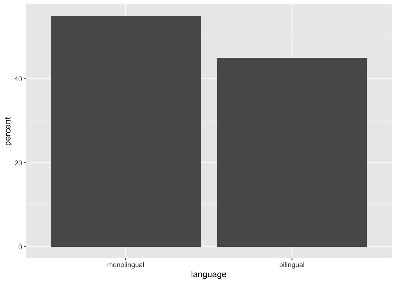
Figure 2: Bar chart of pre-calculated counts.
Histogram
ggplot(dat, aes(x = age)) +
  geom_histogram()
## `stat_bin()` using `bins = 30`. Pick better value with `binwidth`.
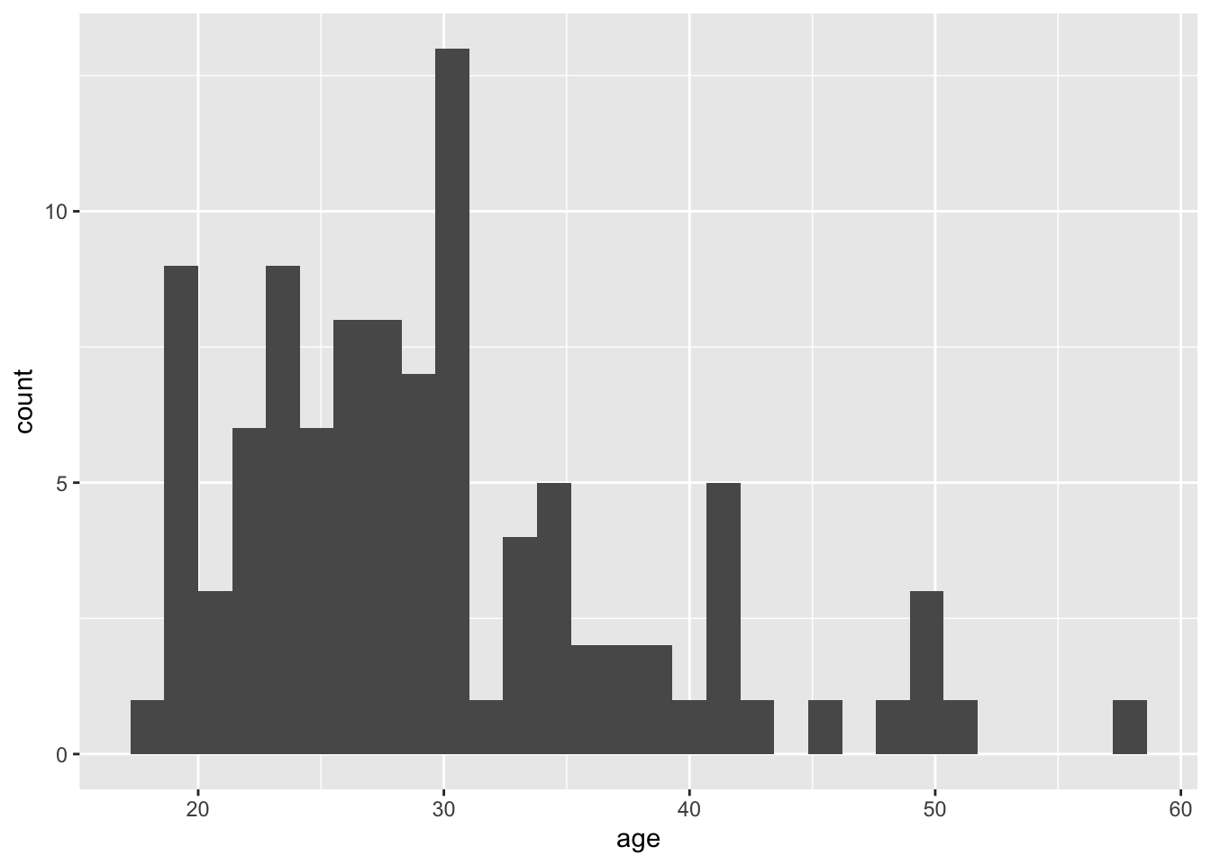
Figure 3: Histogram of ages.
ggplot(dat, aes(x = age)) +
  geom_histogram(binwidth = 5)
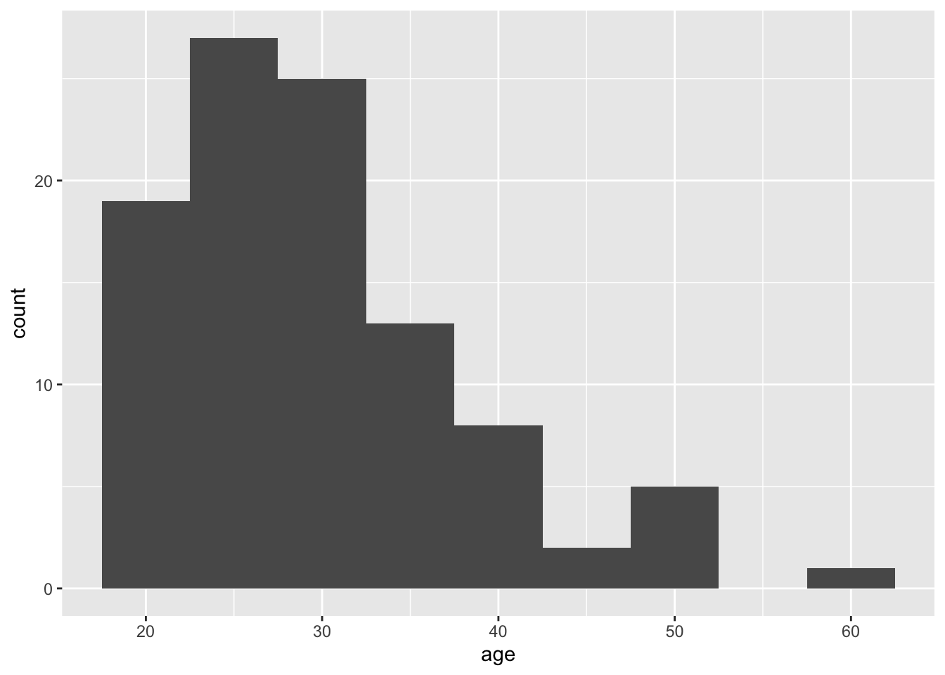
Figure 4: Histogram of ages where each bin covers one year.
Customisation 1
Changing colours
ggplot(dat, aes(age)) +
  geom_histogram(binwidth = 1,
                 fill = "white",
                 colour = "black")
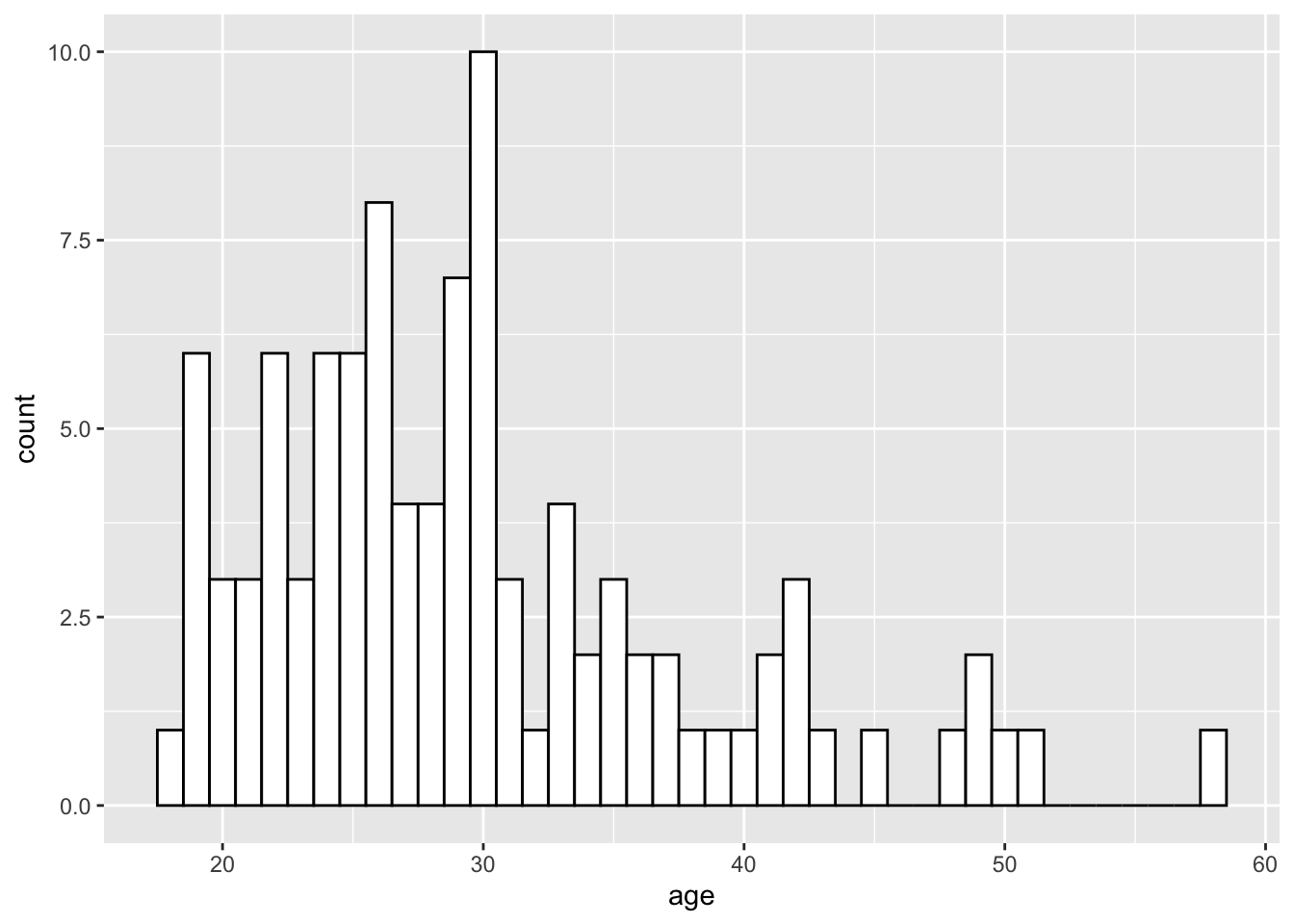
Figure 5: Histogram with custom colors for bar fill and line colors.
Editing axis names and labels
ggplot(dat, aes(language)) +
  geom_bar() +
  scale_x_discrete(name = "Language group",
                   labels = c("Monolingual", "Bilingual")) +
  scale_y_continuous(name = "Number of participants",
                     breaks = c(0,10,20,30,40,50))
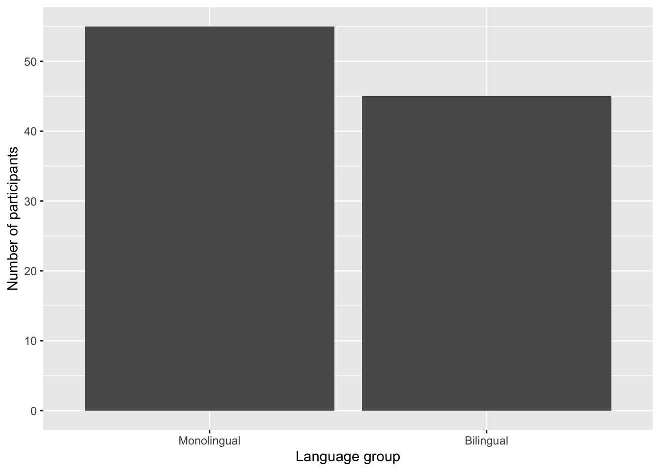
Figure 6: Bar chart with custom axis labels.
Discrete vs continuous errors
ggplot(dat, aes(language)) +
  geom_bar() +
  scale_x_continuous(name = "Language group",
                   labels = c("Monolingual", "Bilingual"))
Adding a theme
ggplot(dat, aes(age)) +
  geom_histogram(binwidth = 1, fill = "wheat", color = "black") +
  scale_x_continuous(name = "Participant age (years)") +
  theme_minimal()
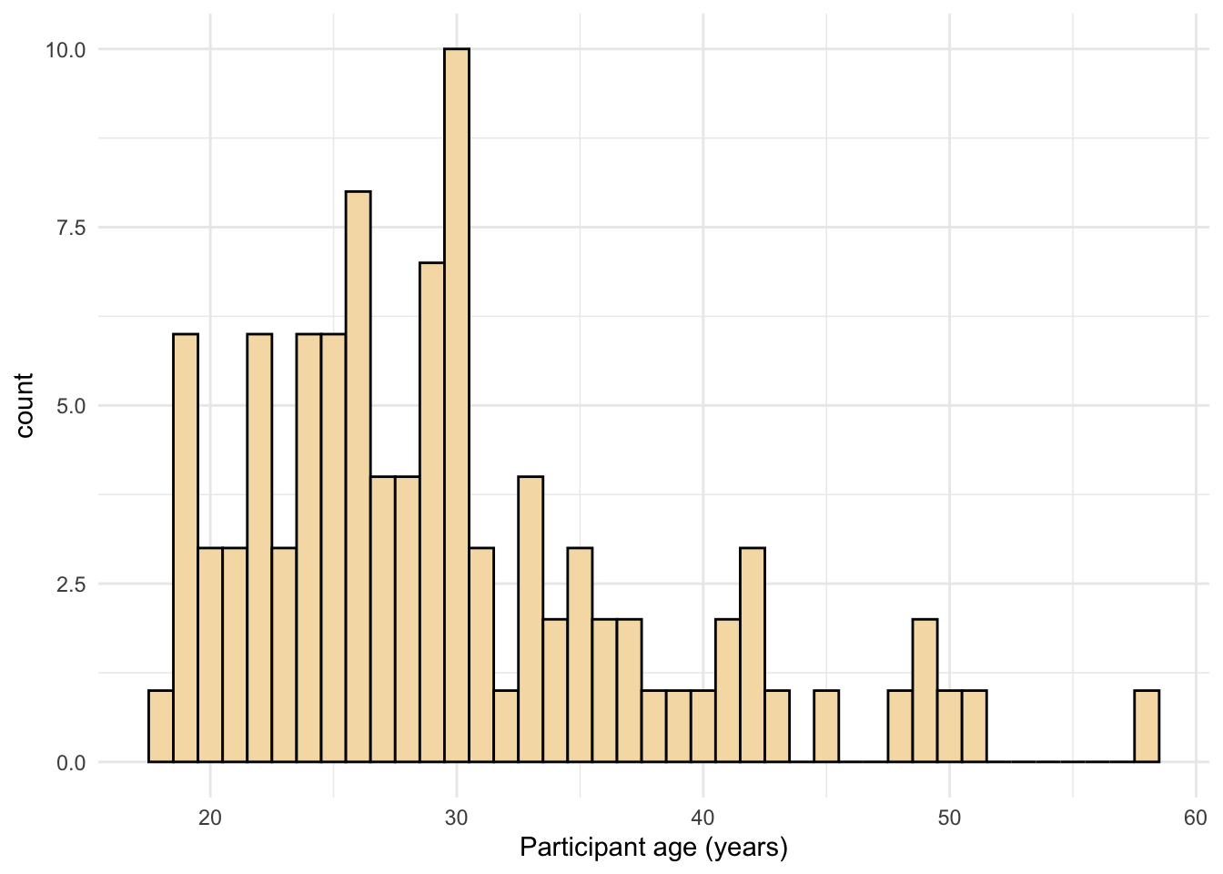
Figure 7: Histogram with a custom theme.
theme_set(theme_minimal())
Chapter 3 Transforming data
Transforming data
Step 1
long <- pivot_longer(data = dat,
                     cols = rt_word:acc_nonword,
                     names_to = c("dv_condition"),
                     values_to = "dv")
Step 2
long2 <- pivot_longer(data = dat,
                     cols = rt_word:acc_nonword,
                     names_sep = "_",
                     names_to = c("dv_type", "condition"),
                     values_to = "dv")
Step 3
dat_long <- pivot_wider(long2,
                        names_from = "dv_type",
                        values_from = "dv")
Combined steps
dat_long <- pivot_longer(data = dat,
                     cols = rt_word:acc_nonword,
                     names_sep = "_",
                     names_to = c("dv_type", "condition"),
                     values_to = "dv") %>%
  pivot_wider(names_from = "dv_type",
              values_from = "dv")

glimpse(dat_long)
## Rows: 200
## Columns: 6
## $ id        <chr> "S001", "S001", "S002", "S002", "S003", "S003", "S004", "S00…
## $ age       <dbl> 22, 22, 33, 33, 23, 23, 28, 28, 26, 26, 29, 29, 20, 20, 30, …
## $ language  <fct> monolingual, monolingual, monolingual, monolingual, monoling…
## $ condition <chr> "word", "nonword", "word", "nonword", "word", "nonword", "wo…
## $ rt        <dbl> 379.4585, 516.8176, 312.4513, 435.0404, 404.9407, 458.5022, …
## $ acc       <dbl> 99, 90, 94, 82, 96, 87, 92, 76, 91, 83, 96, 78, 95, 86, 91, …
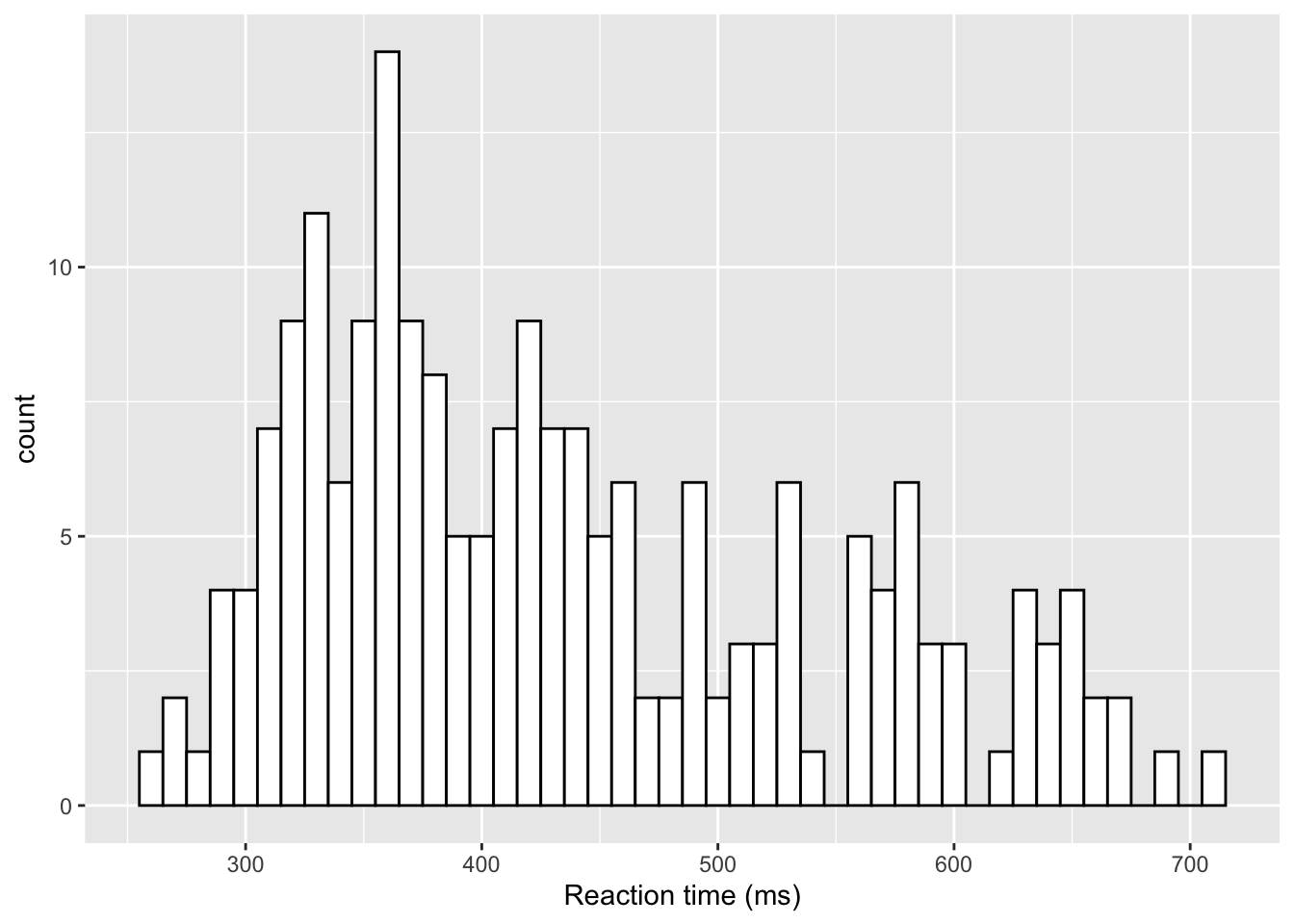
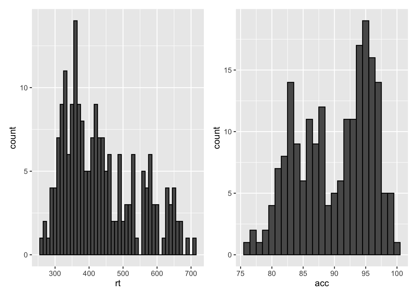
Histogram 2
ggplot(dat_long, aes(x = rt)) +
  geom_histogram(binwidth = 10, fill = "white", colour = "black") +
  scale_x_continuous(name = "Reaction time (ms)")
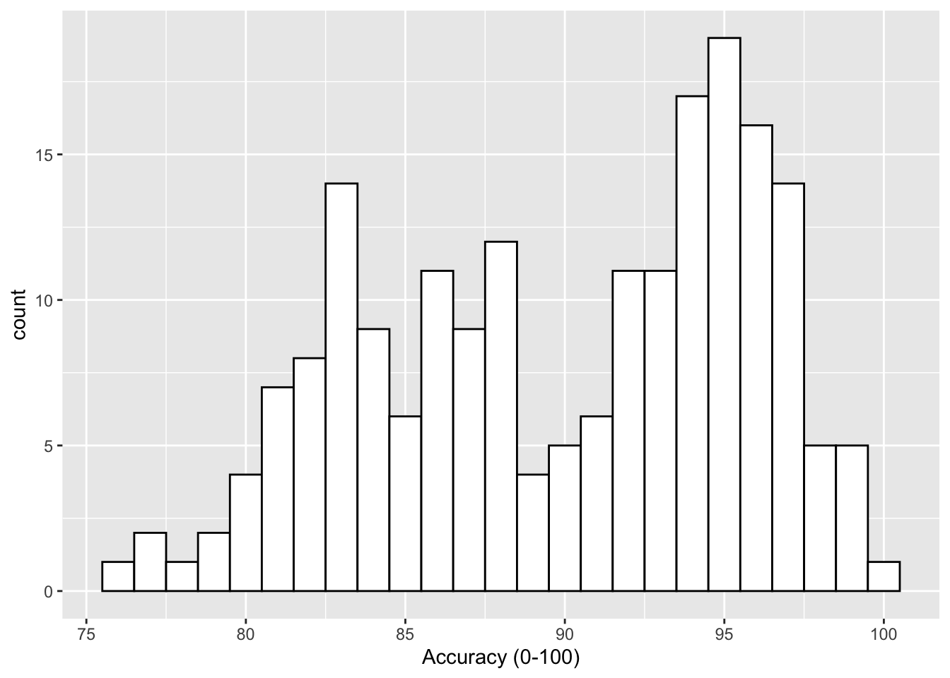
ggplot(dat_long, aes(x = acc)) +
  geom_histogram(binwidth = 1, fill = "white", colour = "black") +
  scale_x_continuous(name = "Accuracy (0-100)")
Density plots
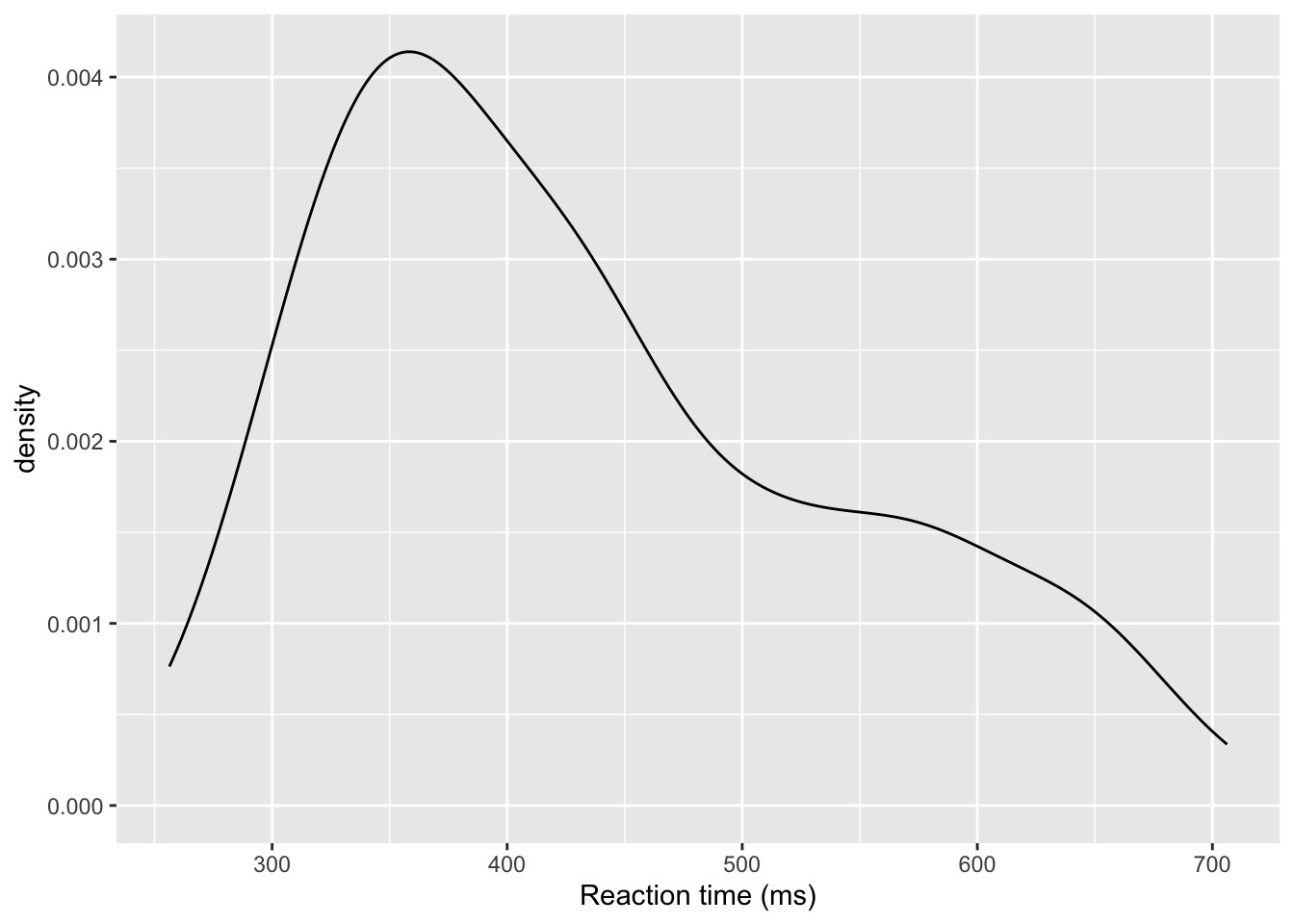
ggplot(dat_long, aes(x = rt)) +
  geom_density()+
  scale_x_continuous(name = "Reaction time (ms)")
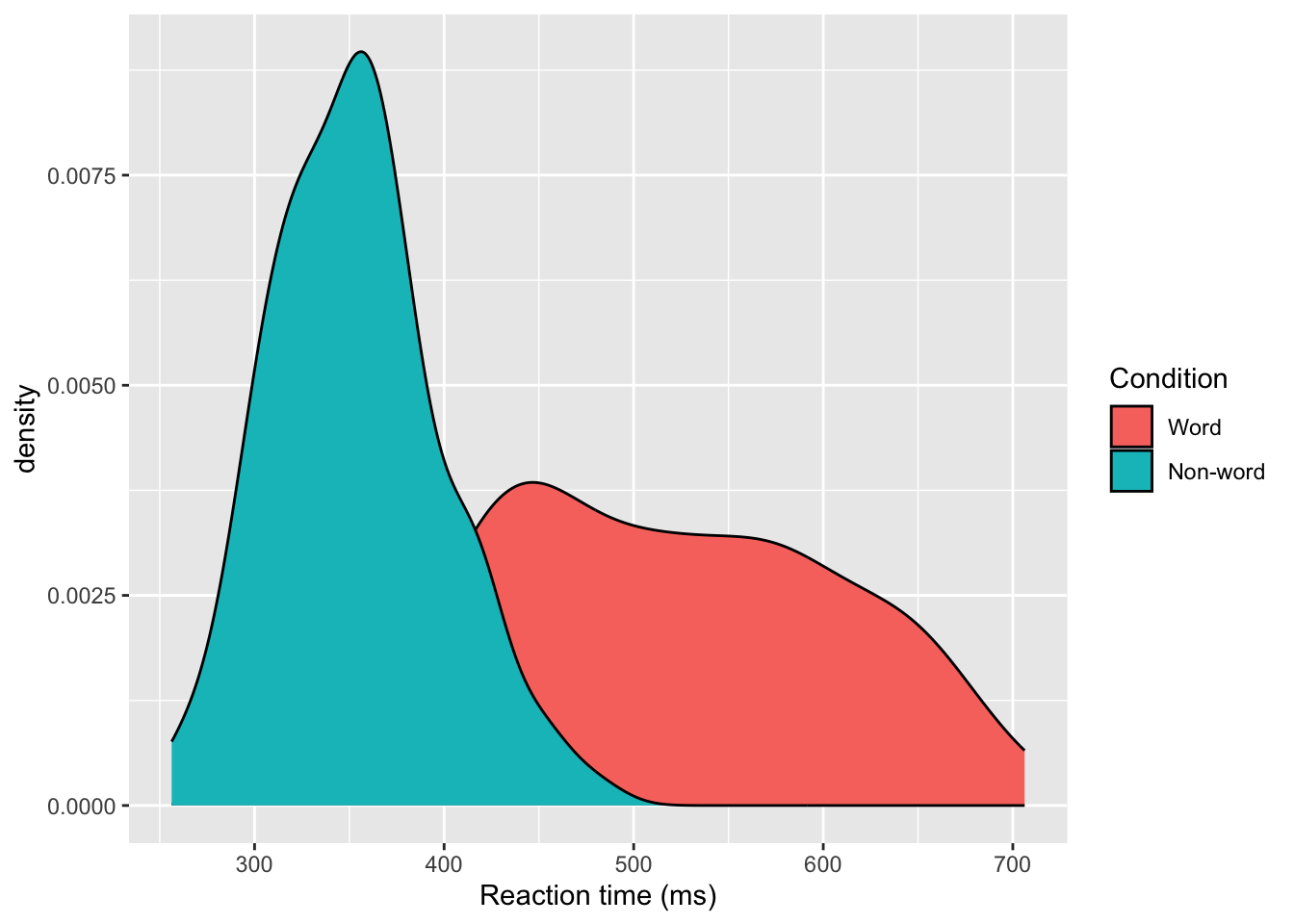
Grouped density plots
ggplot(dat_long, aes(x = rt, fill = condition)) +
  geom_density()+
  scale_x_continuous(name = "Reaction time (ms)") +
  scale_fill_discrete(name = "Condition",
                      labels = c("Word", "Non-word"))
Scatterplots
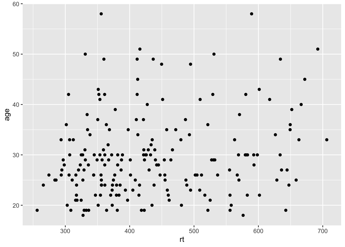
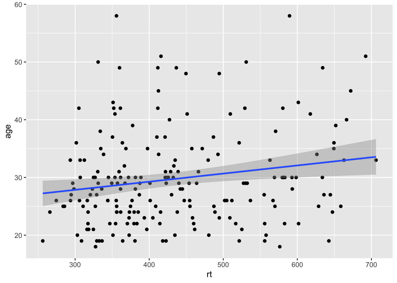
ggplot(dat_long, aes(x = rt, y = age)) +
  geom_point()
With line of best fit
ggplot(dat_long, aes(x = rt, y = age)) +
  geom_point() +
  geom_smooth(method = "lm")
## `geom_smooth()` using formula = 'y ~ x'
Grouped scatterplots
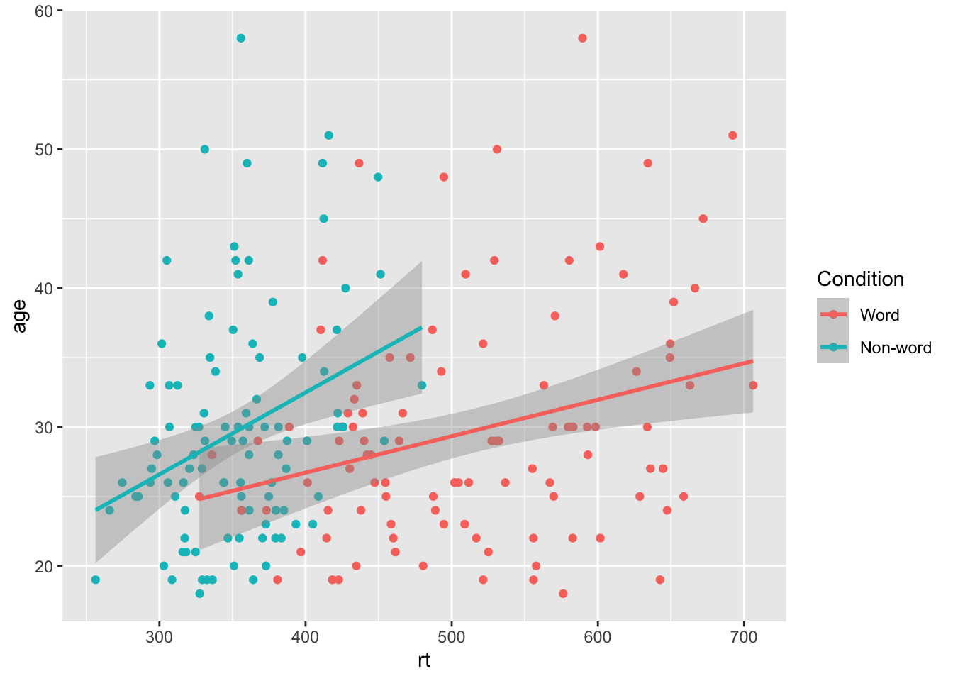
ggplot(dat_long, aes(x = rt, y = age, colour = condition)) +
  geom_point() +
  geom_smooth(method = "lm") +
  scale_colour_discrete(name = "Condition",
                      labels = c("Word", "Non-word"))
## `geom_smooth()` using formula = 'y ~ x'
Customisation 2
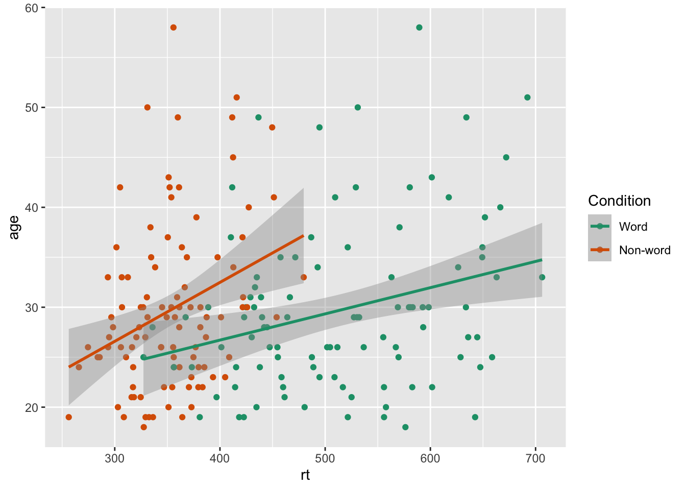
Accessible colour schemes
ggplot(dat_long, aes(x = rt, y = age, colour = condition)) +
  geom_point() +
  geom_smooth(method = "lm") +
  scale_colour_brewer(name = "Condition",
                      labels = c("Word", "Non-word"),
                      palette = "Dark2")
## `geom_smooth()` using formula = 'y ~ x'
Chapter 4 Representing summary statistics
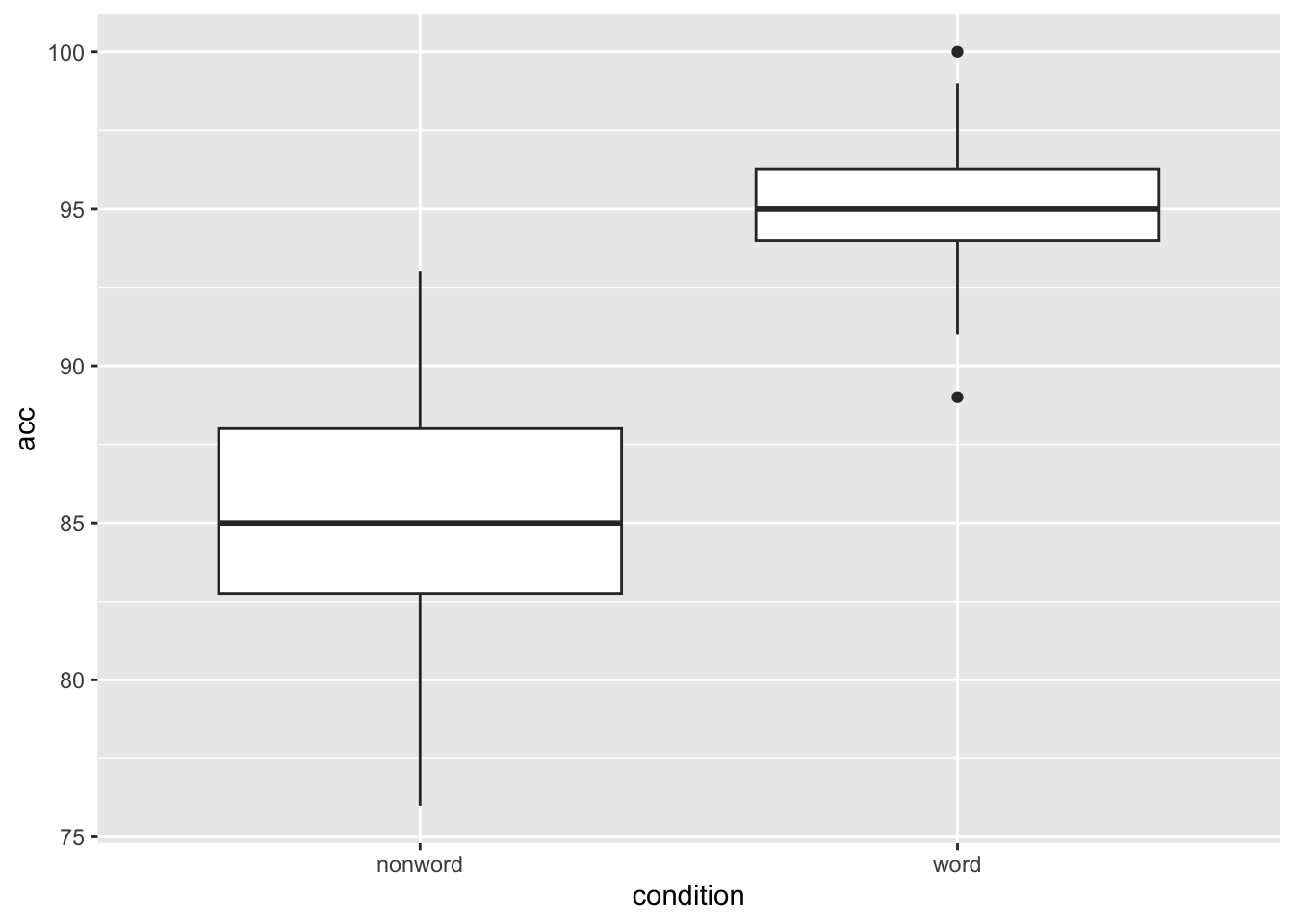
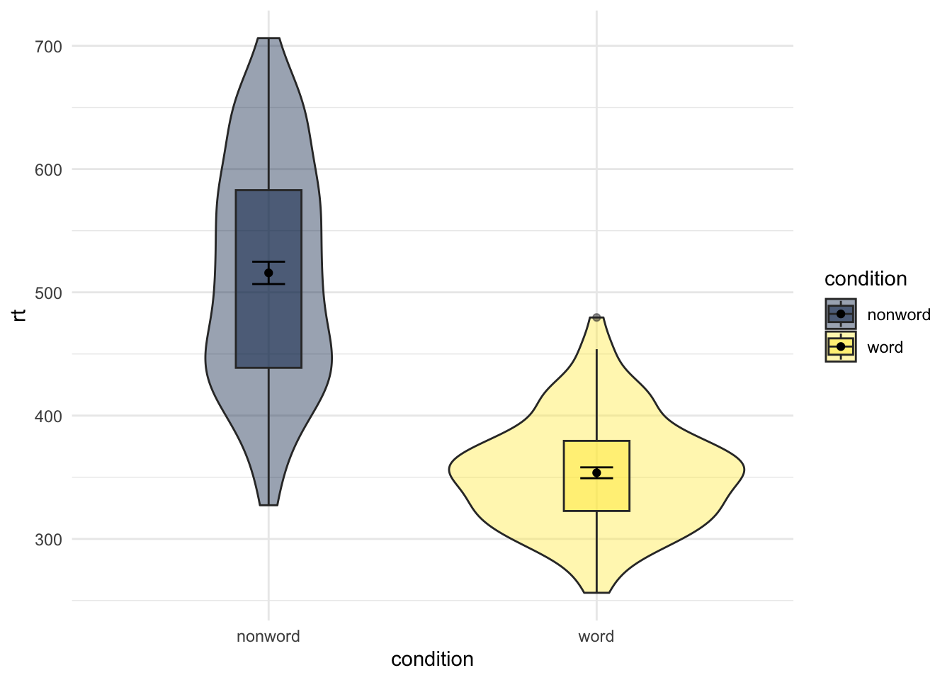
Boxplots
ggplot(dat_long, aes(x = condition, y = acc)) +
  geom_boxplot()
Grouped boxplots
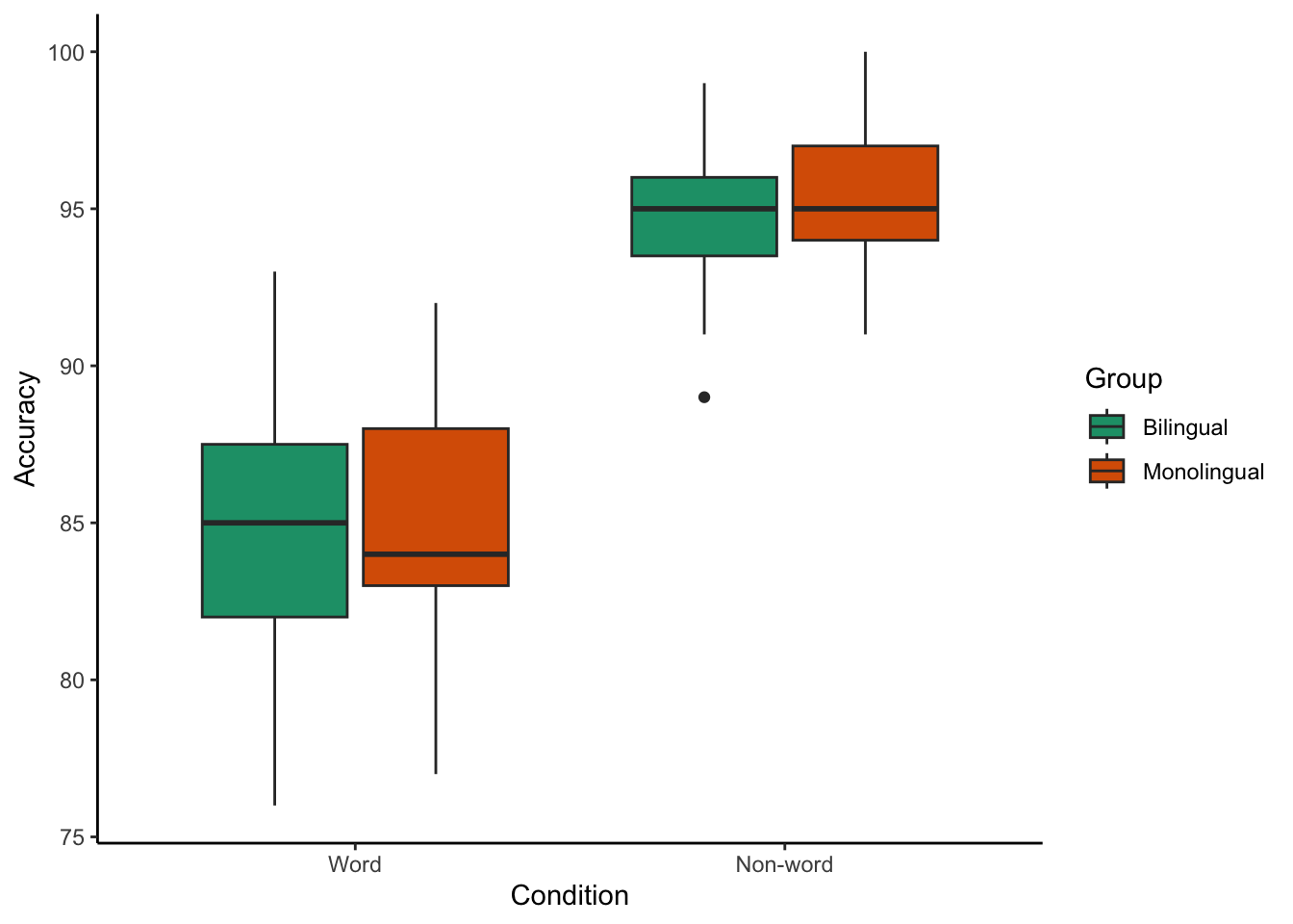
ggplot(dat_long, aes(x = condition, y = acc, fill = language)) +
  geom_boxplot() +
  scale_fill_brewer(palette = "Dark2",
                    name = "Group",
                    labels = c("Bilingual", "Monolingual")) +
  theme_classic() +
  scale_x_discrete(name = "Condition",
                   labels = c("Word", "Non-word")) +
  scale_y_continuous(name = "Accuracy")
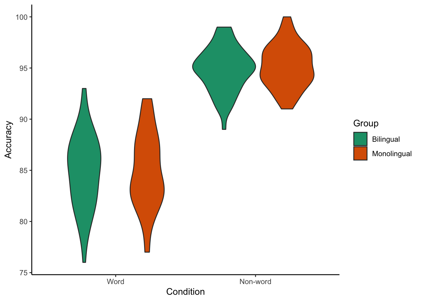
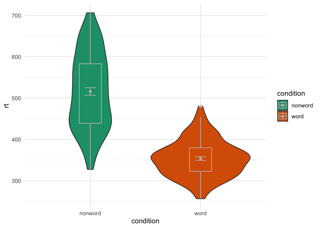
Violin plots
ggplot(dat_long, aes(x = condition, y = acc, fill = language)) +
  geom_violin() +
  scale_fill_brewer(palette = "Dark2",
                    name = "Group",
                    labels = c("Bilingual", "Monolingual")) +
  theme_classic() +
  scale_x_discrete(name = "Condition",
                   labels = c("Word", "Non-word")) +
  scale_y_continuous(name = "Accuracy")
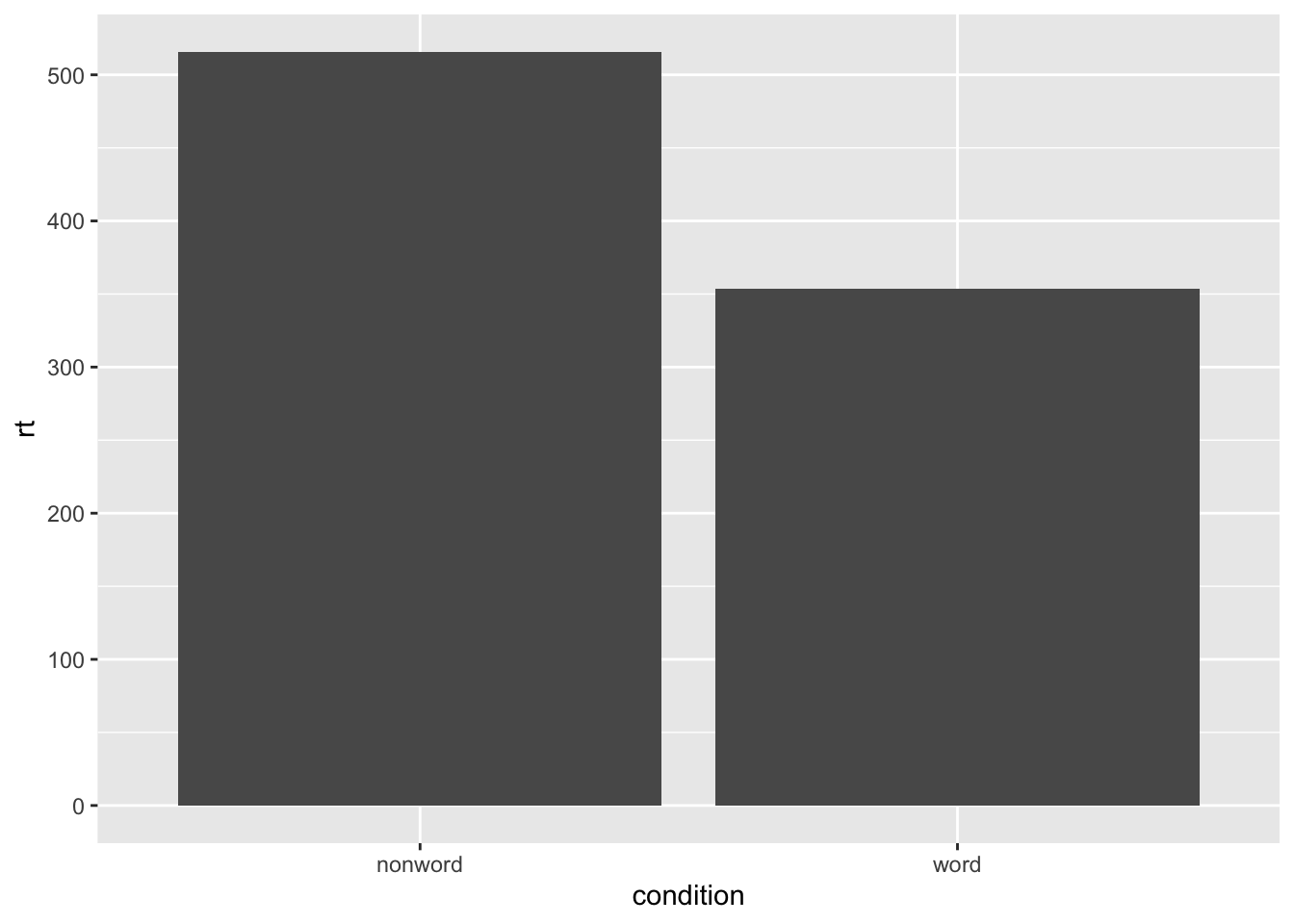
Bar chart of means
ggplot(dat_long, aes(x = condition, y = rt)) +
  stat_summary(fun = "mean", geom = "bar")
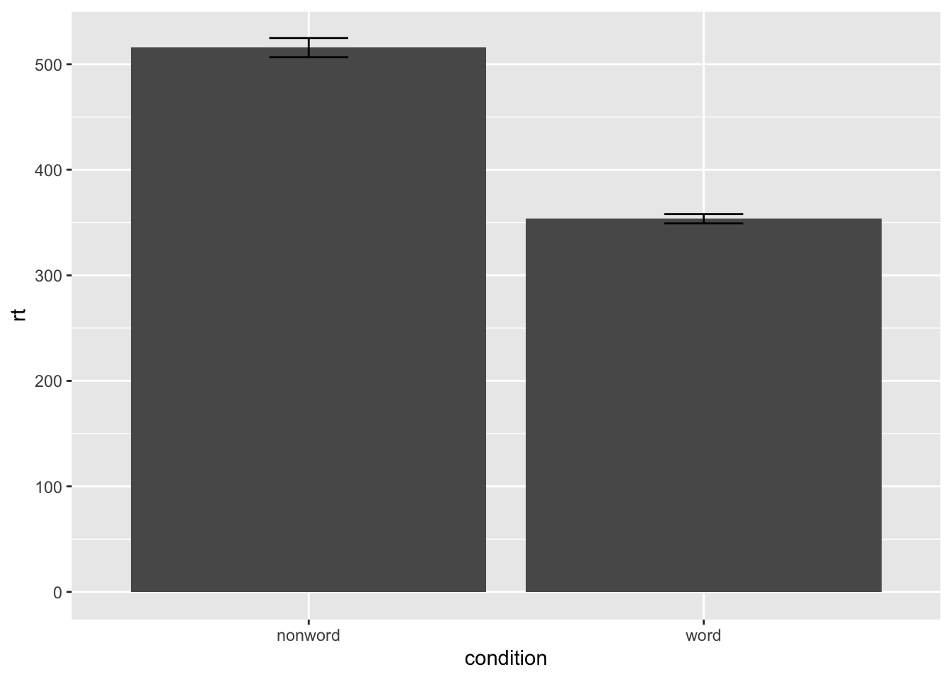
ggplot(dat_long, aes(x = condition, y = rt)) +
  stat_summary(fun = "mean", geom = "bar") +
  stat_summary(fun.data = "mean_se", geom = "errorbar", width = .2)
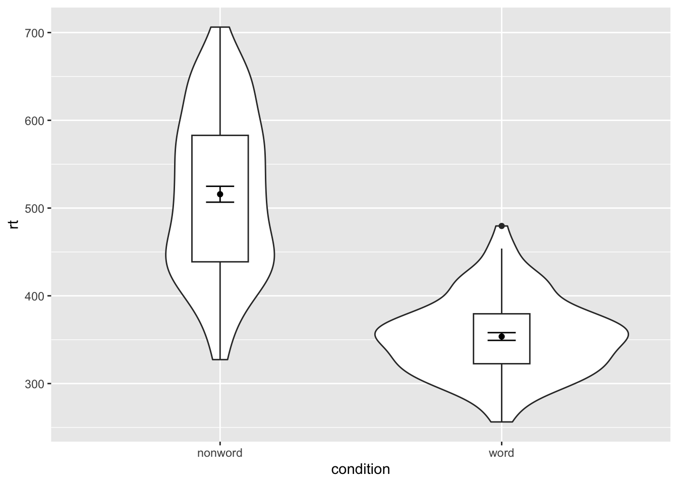
Violin-boxplot
ggplot(dat_long, aes(x = condition, y= rt)) +
  geom_violin() +
  # remove the median line with fatten = NULL
  geom_boxplot(width = .2, fatten = NULL) +
  stat_summary(fun = "mean", geom = "point") +
  stat_summary(fun.data = "mean_se", geom = "errorbar", width = .1)
## Warning: Removed 1 rows containing missing values (`geom_segment()`).
## Removed 1 rows containing missing values (`geom_segment()`).
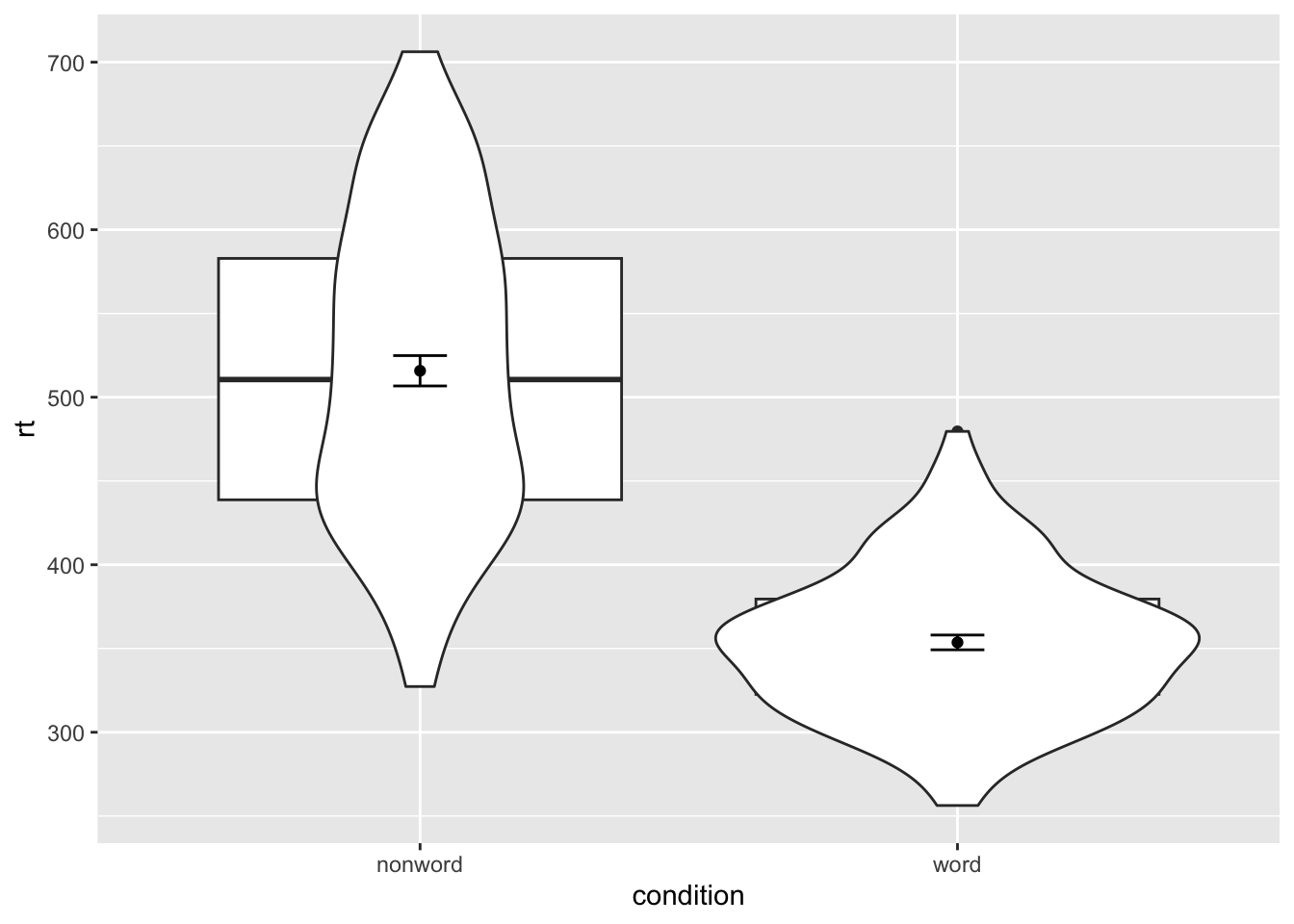
Messy layers
ggplot(dat_long, aes(x = condition, y= rt)) +
  geom_boxplot() +
  geom_violin() +
  stat_summary(fun = "mean", geom = "point") +
  stat_summary(fun.data = "mean_se", geom = "errorbar", width = .1)
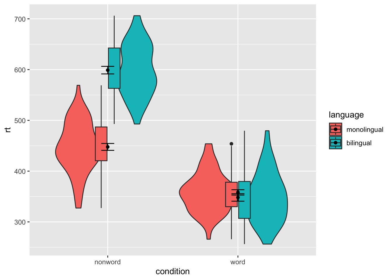
Grouped violin-boxplots
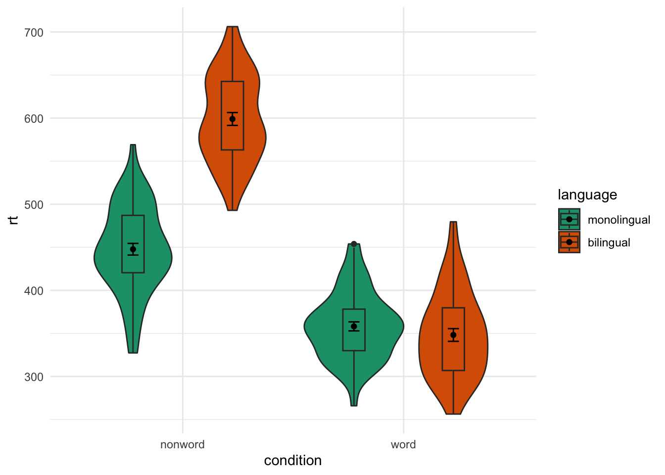
ggplot(dat_long, aes(x = condition, y= rt, fill = language)) +
  geom_violin() +
  geom_boxplot(width = .2, fatten = NULL) +
  stat_summary(fun = "mean", geom = "point") +
  stat_summary(fun.data = "mean_se", geom = "errorbar", width = .1)
## Warning: Removed 1 rows containing missing values (`geom_segment()`).
## Removed 1 rows containing missing values (`geom_segment()`).
## Removed 1 rows containing missing values (`geom_segment()`).
## Removed 1 rows containing missing values (`geom_segment()`).
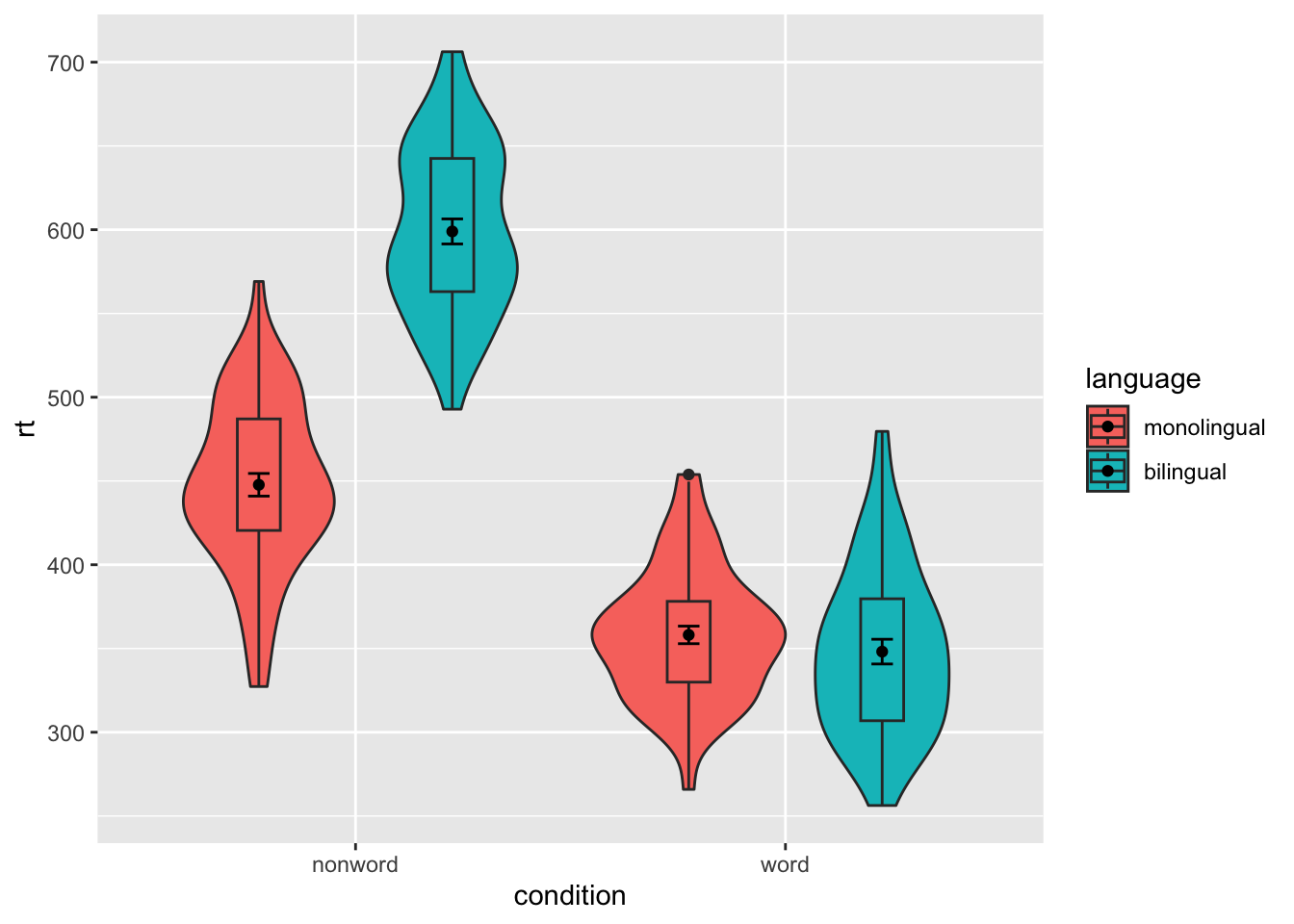
Fixed positions
ggplot(dat_long, aes(x = condition, y= rt, fill = language)) +
  geom_violin() +
  geom_boxplot(width = .2, fatten = NULL, position = position_dodge(.9)) +
  stat_summary(fun = "mean", geom = "point",
               position = position_dodge(.9)) +
  stat_summary(fun.data = "mean_se", geom = "errorbar", width = .1,
               position = position_dodge(.9))
## Warning: Removed 1 rows containing missing values (`geom_segment()`).
## Removed 1 rows containing missing values (`geom_segment()`).
## Removed 1 rows containing missing values (`geom_segment()`).
## Removed 1 rows containing missing values (`geom_segment()`).
Customisation part 3
Colours
Hard to see colours
ggplot(dat_long, aes(x = condition, y= rt, fill = language)) +
  geom_violin() +
  geom_boxplot(width = .2, fatten = NULL, position = position_dodge(.9)) +
  stat_summary(fun = "mean", geom = "point",
               position = position_dodge(.9)) +
  stat_summary(fun.data = "mean_se", geom = "errorbar", width = .1,
               position = position_dodge(.9)) +
  scale_fill_brewer(palette = "Dark2") +
  theme_minimal()
## Warning: Removed 1 rows containing missing values (`geom_segment()`).
## Removed 1 rows containing missing values (`geom_segment()`).
## Removed 1 rows containing missing values (`geom_segment()`).
## Removed 1 rows containing missing values (`geom_segment()`).
Adjusted geom colours
ggplot(dat_long, aes(x = condition, y= rt, fill = condition)) +
  geom_violin() +
  geom_boxplot(width = .2, fatten = NULL, colour = "grey") +
  stat_summary(fun = "mean", geom = "point", colour = "grey") +
  stat_summary(fun.data = "mean_se", geom = "errorbar", width = .1, colour = "grey") +
  scale_fill_brewer(palette = "Dark2") +
  theme_minimal()
## Warning: Removed 1 rows containing missing values (`geom_segment()`).
## Removed 1 rows containing missing values (`geom_segment()`).
Adjusted colour transparency
ggplot(dat_long, aes(x = condition, y= rt, fill = condition)) +
  geom_violin(alpha = .4) +
  geom_boxplot(width = .2, fatten = NULL, alpha = .5) +
  stat_summary(fun = "mean", geom = "point") +
  stat_summary(fun.data = "mean_se", geom = "errorbar", width = .1) +
  scale_fill_viridis_d(option = "E") +
  theme_minimal()
## Warning: Removed 1 rows containing missing values (`geom_segment()`).
## Removed 1 rows containing missing values (`geom_segment()`).
Chapter 5 Multi-part plots
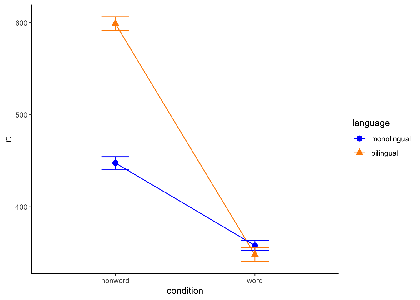
Interaction plots
ggplot(dat_long, aes(x = condition, y = rt,
                     shape = language,
                     group = language,
                     color = language)) +
  stat_summary(fun = "mean", geom = "point", size = 3) +
  stat_summary(fun = "mean", geom = "line") +
  stat_summary(fun.data = "mean_se", geom = "errorbar", width = .2) +
  scale_color_manual(values = c("blue", "darkorange")) +
  theme_classic()
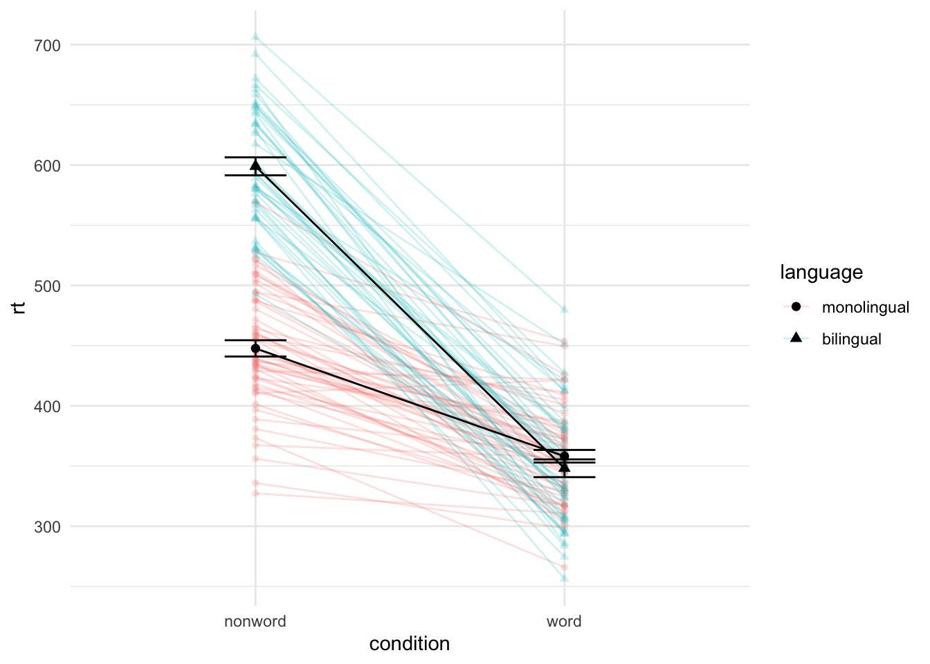
Combined interaction plots
ggplot(dat_long, aes(x = condition, y = rt, group = language, shape = language)) +
  geom_point(aes(colour = language),alpha = .2) +
  geom_line(aes(group = id, colour = language), alpha = .2) +
   stat_summary(fun = "mean", geom = "point", size = 2, colour = "black") +
  stat_summary(fun = "mean", geom = "line", colour = "black") +
  stat_summary(fun.data = "mean_se", geom = "errorbar", width = .2, colour = "black") +
  theme_minimal()
Facets
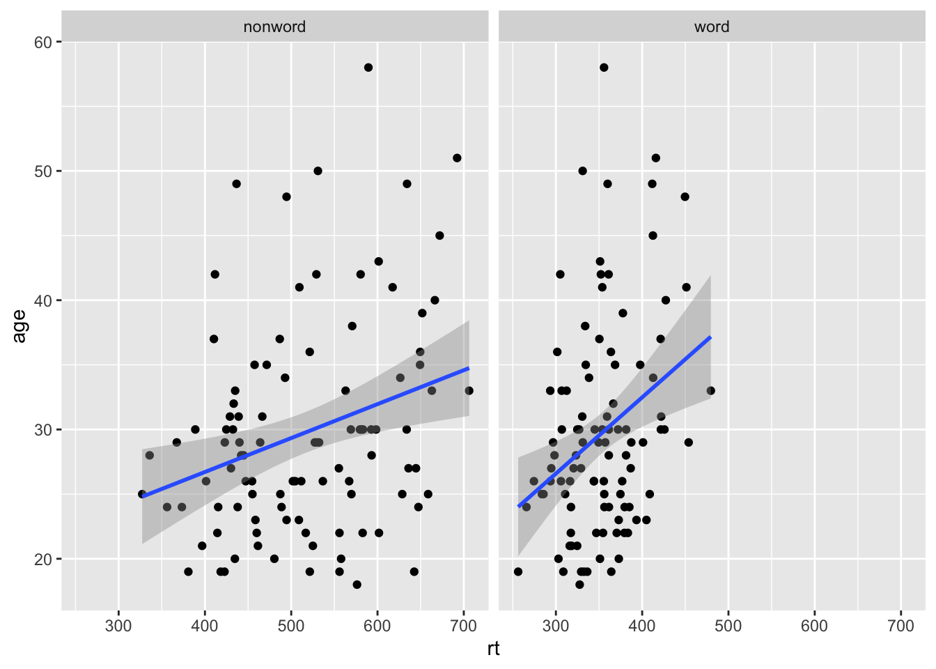
Faceted scatterplots
ggplot(dat_long, aes(x = rt, y = age)) +
  geom_point() +
  geom_smooth(method = "lm") +
  facet_wrap(~condition) +
  scale_color_discrete(name = "Condition",
                      labels = c("Word", "Non-word"))
## `geom_smooth()` using formula = 'y ~ x'
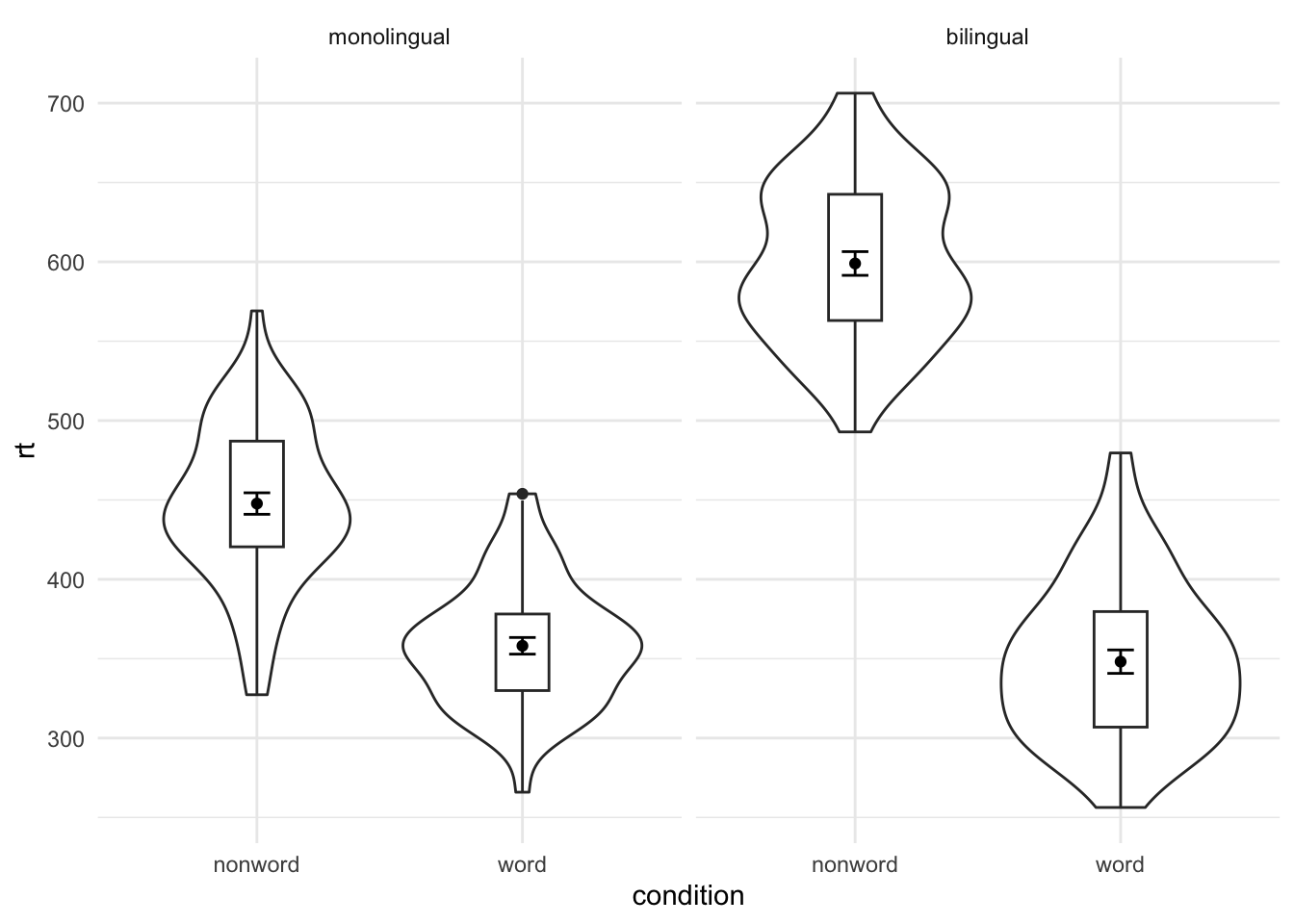
Faceted violin-boxplots
ggplot(dat_long, aes(x = condition, y= rt)) +
  geom_violin() +
  geom_boxplot(width = .2, fatten = NULL) +
  stat_summary(fun = "mean", geom = "point") +
  stat_summary(fun.data = "mean_se", geom = "errorbar", width = .1) +
  facet_wrap(~language) +
  theme_minimal()
## Warning: Removed 1 rows containing missing values (`geom_segment()`).
## Removed 1 rows containing missing values (`geom_segment()`).
## Removed 1 rows containing missing values (`geom_segment()`).
## Removed 1 rows containing missing values (`geom_segment()`).
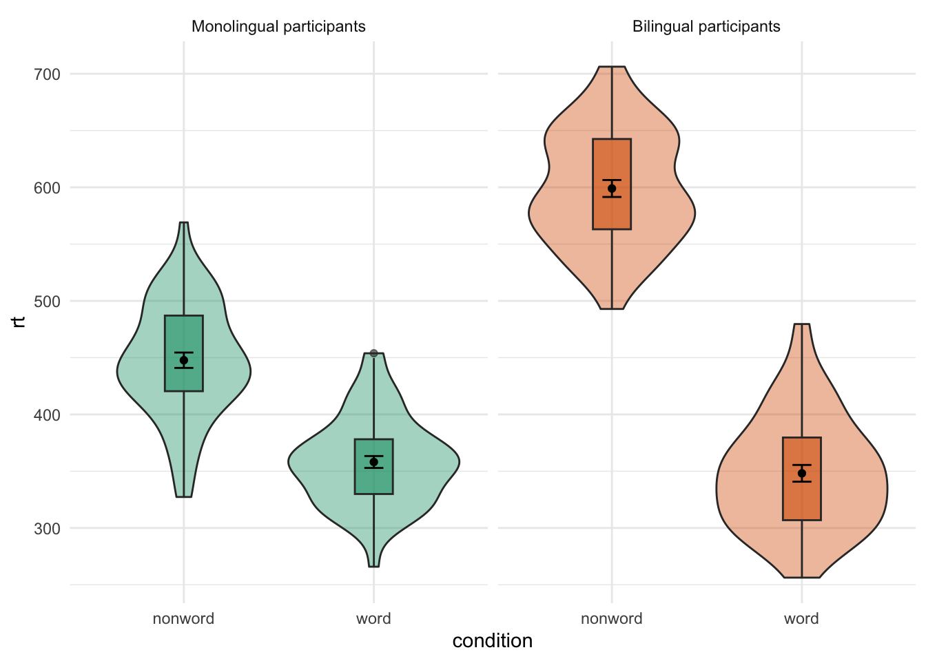
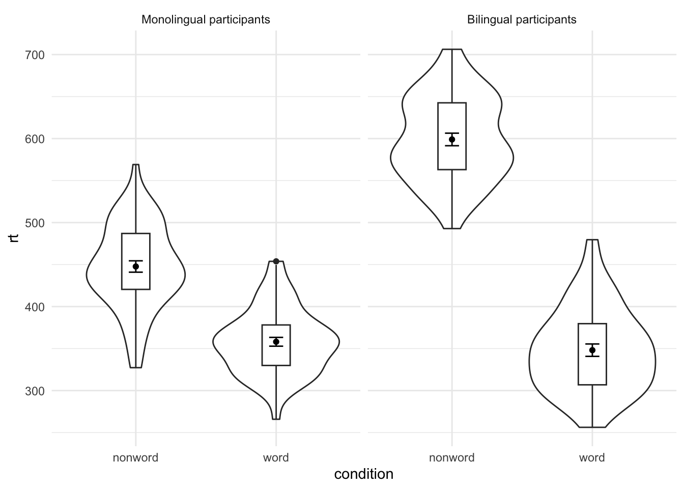
Adjusted the facet labels
ggplot(dat_long, aes(x = condition, y= rt)) +
  geom_violin() +
  geom_boxplot(width = .2, fatten = NULL) +
  stat_summary(fun = "mean", geom = "point") +
  stat_summary(fun.data = "mean_se", geom = "errorbar", width = .1) +
  facet_wrap(~language,
             labeller = labeller(
               language = c(monolingual = "Monolingual participants",
                             bilingual = "Bilingual participants"))) +
  theme_minimal()
## Warning: Removed 1 rows containing missing values (`geom_segment()`).
## Removed 1 rows containing missing values (`geom_segment()`).
## Removed 1 rows containing missing values (`geom_segment()`).
## Removed 1 rows containing missing values (`geom_segment()`).
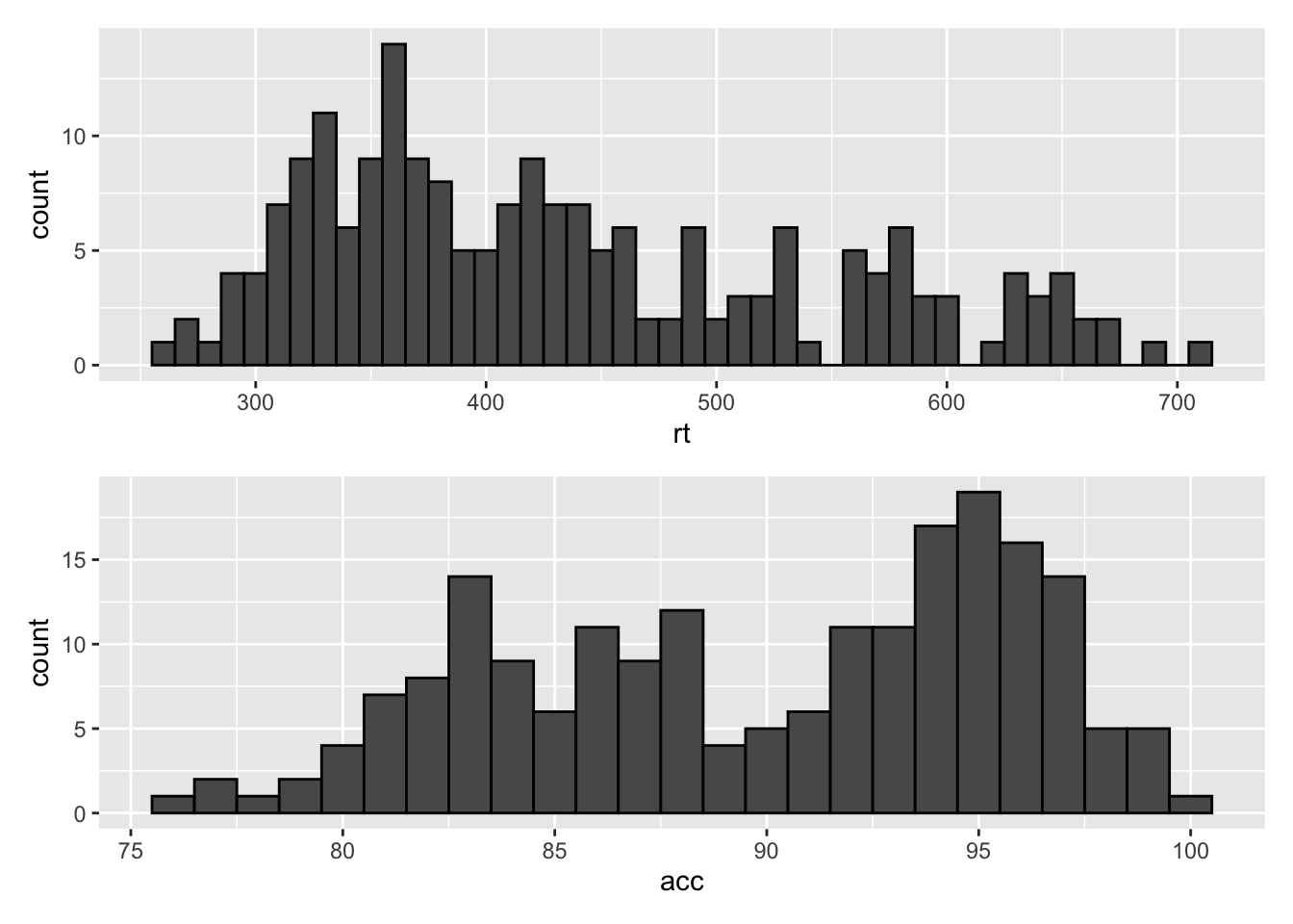
Saving plots
p1 <- ggplot(dat_long, aes(x = rt)) +
  geom_histogram(binwidth = 10, color = "black")

p2 <- ggplot(dat_long, aes(x = acc)) +
  geom_histogram(binwidth = 1, color = "black")
p3 <- p1 + theme_minimal()
Exporting plots
ggsave(filename = "my_plot.png") # save last displayed plot
## Saving 7 x 5 in image
ggsave(filename = "my_plot.png", plot = p3) # save plot p3
## Saving 7 x 5 in image
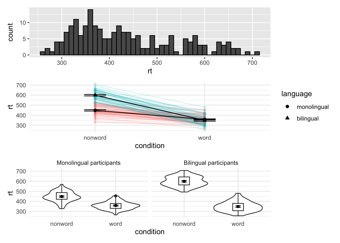
Mulitple plots
Combining two plots
p1 + p2 # side-by-side
p1 / p2 # stacked
Combining three or more plots
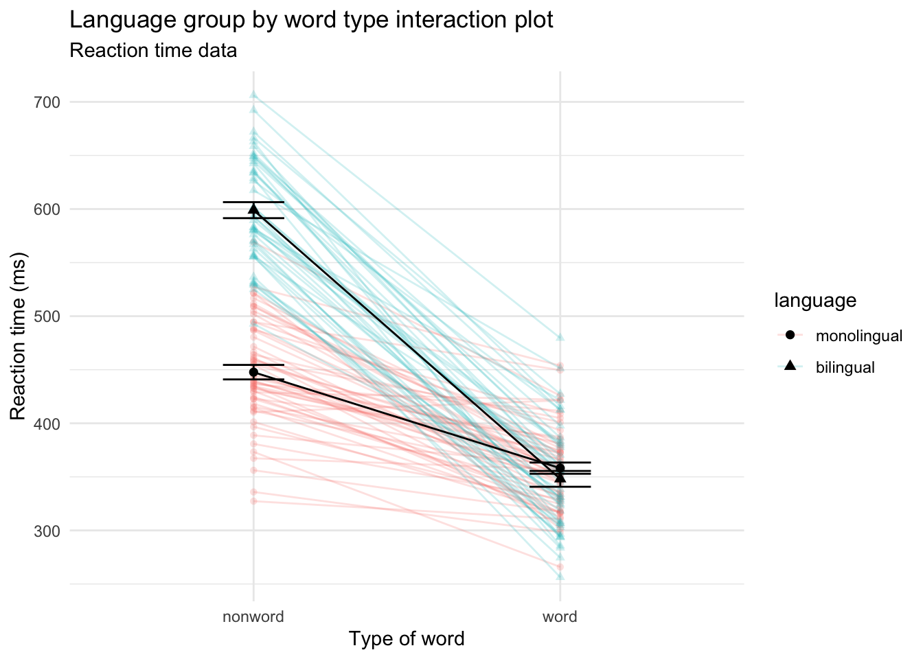
p5 <- ggplot(dat_long, aes(x = condition, y = rt, group = language, shape = language)) +
  geom_point(aes(colour = language),alpha = .2) +
  geom_line(aes(group = id, colour = language), alpha = .2) +
  stat_summary(fun = "mean", geom = "point", size = 2, colour = "black") +
  stat_summary(fun = "mean", geom = "line", colour = "black") +
  stat_summary(fun.data = "mean_se", geom = "errorbar", width = .2, colour = "black") +
  theme_minimal()

p6 <- ggplot(dat_long, aes(x = condition, y= rt)) +
  geom_violin() +
  geom_boxplot(width = .2, fatten = NULL) +
  stat_summary(fun = "mean", geom = "point") +
  stat_summary(fun.data = "mean_se", geom = "errorbar", width = .1) +
  facet_wrap(~language,
             labeller = labeller(
               language = (c(monolingual = "Monolingual participants",
                             bilingual = "Bilingual participants")))) +
  theme_minimal()
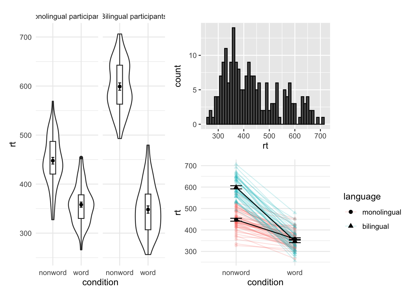
p1 /p5 / p6
## Warning: Removed 1 rows containing missing values (`geom_segment()`).
## Removed 1 rows containing missing values (`geom_segment()`).
## Removed 1 rows containing missing values (`geom_segment()`).
## Removed 1 rows containing missing values (`geom_segment()`).
(p1 + p6) / p5
## Warning: Removed 1 rows containing missing values (`geom_segment()`).
## Removed 1 rows containing missing values (`geom_segment()`).
## Removed 1 rows containing missing values (`geom_segment()`).
## Removed 1 rows containing missing values (`geom_segment()`).
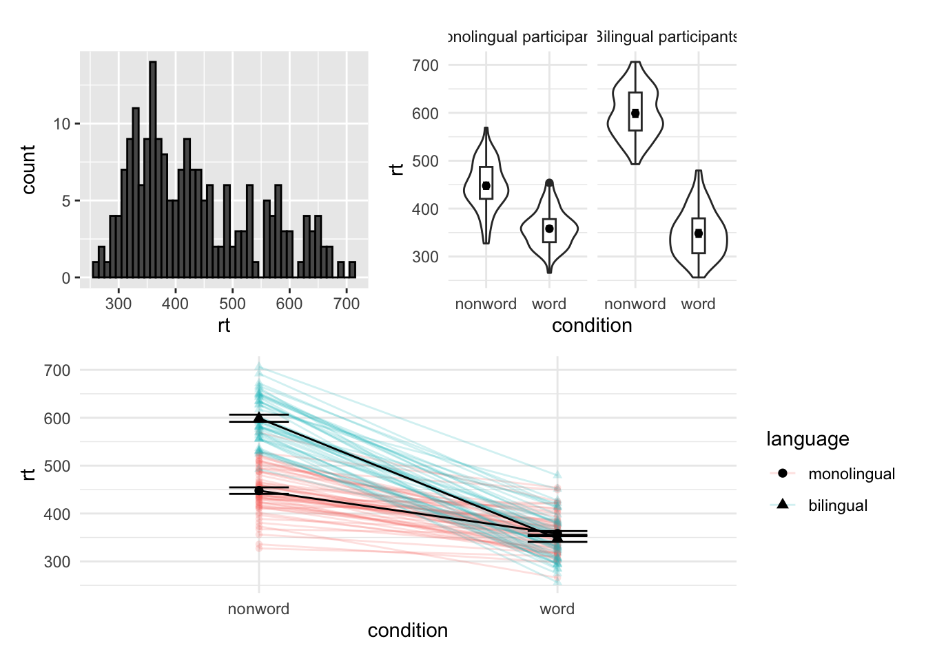
p6 | p1 / p5
## Warning: Removed 1 rows containing missing values (`geom_segment()`).
## Removed 1 rows containing missing values (`geom_segment()`).
## Removed 1 rows containing missing values (`geom_segment()`).
## Removed 1 rows containing missing values (`geom_segment()`).
Customisation 4
Axis labels
p5 + labs(x = "Type of word",
          y = "Reaction time (ms)",
          title = "Language group by word type interaction plot",
          subtitle = "Reaction time data")
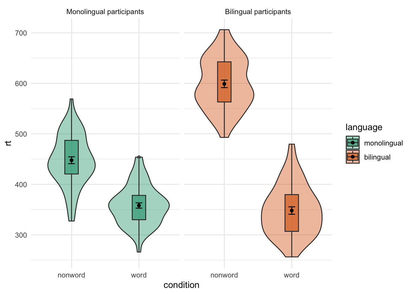
Non-meanginful colours
With redundant legend
ggplot(dat_long, aes(x = condition, y= rt, fill = language)) +
  geom_violin(alpha = .4) +
  geom_boxplot(width = .2, fatten = NULL, alpha = .6) +
  stat_summary(fun = "mean", geom = "point") +
  stat_summary(fun.data = "mean_se", geom = "errorbar", width = .1) +
  facet_wrap(~language,
             labeller = labeller(
               language = (c(monolingual = "Monolingual participants",
                             bilingual = "Bilingual participants")))) +
  theme_minimal() +
  scale_fill_brewer(palette = "Dark2")
## Warning: Removed 1 rows containing missing values (`geom_segment()`).
## Removed 1 rows containing missing values (`geom_segment()`).
## Removed 1 rows containing missing values (`geom_segment()`).
## Removed 1 rows containing missing values (`geom_segment()`).
Without redundant legend
ggplot(dat_long, aes(x = condition, y= rt, fill = language)) +
  geom_violin(alpha = .4) +
  geom_boxplot(width = .2, fatten = NULL, alpha = .6) +
  stat_summary(fun = "mean", geom = "point") +
  stat_summary(fun.data = "mean_se", geom = "errorbar", width = .1) +
  facet_wrap(~language,
             labeller = labeller(language = (c(monolingual = "Monolingual participants", bilingual = "Bilingual participants")))) +
  theme_minimal() +
  scale_fill_brewer(palette = "Dark2") +
  guides(fill = FALSE)
## Warning: The `<scale>` argument of `guides()` cannot be `FALSE`. Use "none" instead as
## of ggplot2 3.3.4.
## Warning: Removed 1 rows containing missing values (`geom_segment()`).
## Removed 1 rows containing missing values (`geom_segment()`).
## Removed 1 rows containing missing values (`geom_segment()`).
## Removed 1 rows containing missing values (`geom_segment()`).